The objective of this project was to transform a dense, academic human geography essay into a highly engaging, visually compelling editorial feature. The target audience consisted of students, educators, and intellectually curious readers who appreciate culture, demographics, and spatial relationships. The core challenge lay in translating complex socio-geographic concepts—such as urbanization, migration patterns, or cultural landscapes—into an accessible, text-heavy editorial layout that maintains a perfect balance between typographic readability and visual impact.
Serving as the Sole Graphic Designer, I was responsible for the creative direction, asset curation, typography mapping, and layout execution. The required deliverables included a striking magazine cover designed to hook the reader, alongside a cohesive 2-page editorial spread. A major constraint was managing the extensive text volume of the essay without sacrificing white space, while ensuring the layout structure adhered strictly to professional print-ready grids.
Action
-
Research & Mapping: Began by thoroughly reading the essay to extract core themes, keywords, and geographic data points, organizing these concepts into a comprehensive mind map.
-
Ideation: Sketched thumbnail layouts to explore a variety of copy-to-imagery ratios, testing different placements for the headline and imagery.
-
Prototyping: Developed digital rough drafts in Adobe InDesign, experimenting with geographic design motifs such as topo map lines, data visualizations, and stark cultural photography.
World & Cultural Geography

I applied empathetic design thinking to step into the shoes of a casual reader encountering dense academic text. By utilizing an asymmetric 5-column modular grid, I established a clear visual hierarchy that guides the eye naturally from the bold headline to the body paragraphs.
-
Typography: Paired a high-contrast serif font for the headlines (evoking an authoritative, editorial feel) with a highly legible, clean sans-serif for the body text.
-
Design Principles: Employed the principle of Proximity to group related geo-data and captions together, and used strategic Scale by magnifying a central focal image on the spread to anchor the viewer's attention and break editorial monotony.
MWCC Mount Observer

Early drafts and layouts

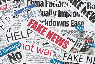
This project required designing a powerful, thought-provoking front page cover for Mount Wachusett Community College's student newspaper, The Mount Observer. The issue focused heavily on the highly critical, politically charged themes of freedom of speech and freedom of the press. The target audience encompassed a diverse community college student body, faculty, and local citizens. The central challenge was to craft a universally understood visual metaphor that captured the systemic threats, censorship, and bravery surrounding modern journalism without relying on clichéd or overly literal imagery.
In my role as the Editorial Designer, I took full charge of the conceptualization, graphic asset creation, and final cover layout. The required deliverable was a high-impact, print-ready tabloid newspaper cover. The primary limitations included a strict, fast-paced print deadline, the need to command attention from a crowded campus newsstand, and the requirement to integrate existing newspaper branding and masthead elements seamlessly into the design.
-
Brainstorming: Drafted an attribute list linking journalism tools (pens, cameras, microphones) with symbols of restriction and liberation (chains, padlocks, wings, megaphones).
-
Thumbnails: Sketched diverse conceptual thumbnails, ranging from minimalist vector graphics to high-contrast photo-manipulations depicting silenced voices.
-
Drafting & Testing: Formulated two distinct digital drafts—one utilizing stark, aggressive propaganda-style graphics, and another using a clean, symbolic approach.
-
Feedback Integration: Presented the rough concepts to the editorial team, ultimately choosing the direction that struck the most impactful balance between professional journalism and urgent advocacy.
Through disciplined design thinking, I built a visual narrative centered on systemic tension and human rights. I relied heavily on the design principles of Contrast and Emphasis to convey the gravity of the subject matter.
-
Color Palette: Deployed a restricted, high-impact color palette of stark black, crisp white, and a commanding editorial red to immediately evoke urgency and importance.
-
Visual Elements: Utilized heavy, bold typography juxtaposed against sharp geometric lines or restrictive imagery to simulate the feeling of censorship.
-
Composition: The final layout left intentional negative space around the central graphic asset, generating a powerful focal point that forces immediate visual engagement from across a room.

Stock photos collected for use