Project 1: Promotional Flyer for Latitude and Lore
-
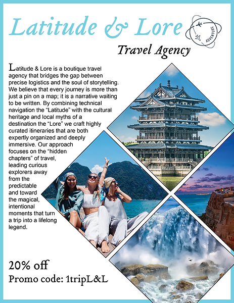
Situation: The goal was to design a high-impact promotional flyer for "Latitude and Lore," a travel agency specializing in immersive, story-driven travel experiences. The challenge was to move beyond generic tourism imagery and instead evoke a sense of history and discovery for an audience seeking curated, meaningful adventures.
-
Task: My role was the lead designer responsible for the concept, layout, and visual identity of the flyer. I had to include specific agency contact details and a call-to-action while adhering to a limited printing budget that required a design that looked premium even on standard paper stock.
-
Action: I began with a mind map centered on "exploration" and "antiquity," leading to an attributes list that included parchment textures, nautical compasses, and serif typography. During the ideation phase, I developed several thumbnails comparing a modern minimalist look versus a "vintage explorer" aesthetic. After selecting the vintage path, I created a rough draft that integrated a high-resolution, sepia-toned landscape with an overlay of a stylized 18th-century map.
-
Result: I applied Design Thinking by prioritizing the user's emotional response—curiosity. I utilized the Principle of Hierarchy by making the brand name ("Latitude") the primary focal point through bold, classic typography, while the contact information occupied the lower third to provide a clean visual "exit." The use of Texture (parchment background) and Analogous Colors (deep ambers and browns) created a cohesive, sophisticated brand voice that successfully differentiates the agency from budget-travel competitors.
Project 2: Art and Music Festival Event Flyer
-
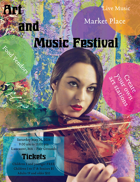
Situation: The objective was to create a vibrant flyer for a local art and music festival. The context required a design that appealed to a diverse demographic—ranging from young families to college students—while capturing the energetic, eclectic atmosphere of a dual-medium event.
-
Task: I was tasked with delivering a digital and print-ready flyer that balanced a large amount of information, including the lineup of 10+ artists/bands, date, time, and venue. The main constraint was maintaining readability despite the high density of text required for the diverse roster.
-
Action: I started with thumbnails focused on different Grids to see how to best organize the artist names. My research involved looking at 1960s psychedelic posters and modern Swiss style for inspiration on combining chaos with order. I developed a prototype using a "modular grid" system. Through feedback from peers, I realized the initial color palette was too aggressive, so I refined it to a high-contrast but more professional "Electric Teal" and "Sunset Orange" scheme.
-
Result: I employed the Principle of Contrast and Vibrant Color to ensure the flyer stood out on busy community boards. To manage the high text volume, I used Proximity—grouping the bands by "Headliner" and "Supporting Act" in different font weights—to guide the viewer’s eye through the data efficiently. This application of Information Architecture within a creative layout ensured the flyer was both an artistic piece and a functional informational tool.